Business Intelligence Dashboard: Benefits, Examples & Best Practices
Learn what a business intelligence dashboard is, how BI dashboards work, their benefits, types, KPI examples, scorecards, best practices, and implementation steps.
Aslisite Team
Digital Experts
Table of Contents
What Is a Business Intelligence Dashboard?
How Does a Business Intelligence Dashboard Work?
What Does a BI Dashboard Show?
Business Intelligence Dashboard Examples
Sales Dashboard
Finance Dashboard
Marketing Dashboard
Operations Dashboard
Inventory Dashboard
Customer Service Dashboard
Types of Business Intelligence Dashboards
1. Strategic Dashboard
2. Operational Dashboard
3. Analytical Dashboard
4. Tactical Dashboard
Benefits of Business Intelligence Dashboards
Faster Decision-Making
Better Visibility
Earlier Problem Detection
Consistent KPI Tracking
Reduced Manual Reporting
Better Team Alignment
Improved Accountability
Better Use of Business Data
Business Intelligence Dashboard vs Report
Business Intelligence Dashboard vs Performance Scorecard
What Makes a Good Business Intelligence Dashboard?
Relevant KPIs
Clear Visual Hierarchy
Simple Design
Reliable Data
Useful Context
Appropriate Filters
Actionability
How to Choose KPIs for a BI Dashboard
How to Build a Business Intelligence Dashboard
Step 1: Define the Business Question
Step 2: Define the Audience
Step 3: Select the KPIs
Step 4: Identify the Data Sources
Step 5: Clean and Standardize the Data
Step 6: Design the Dashboard
Step 7: Validate the Numbers
Step 8: Test With Real Users
Step 9: Define Refresh Frequency
Step 10: Review and Improve
Do Small Businesses Need BI Dashboards?
Custom BI Dashboard vs Ready-Made BI Software
Ready-made BI software may be suitable when:
A custom dashboard may be appropriate when:
Common BI Dashboard Mistakes
Displaying Too Many KPIs
Starting With Charts Instead of Questions
Using Unreliable Data
No Agreed KPI Definition
Making Everything Real-Time
Ignoring the User
No Ownership
Business Intelligence Dashboard Implementation Checklist
Frequently Asked Questions
What is a business intelligence dashboard?
What are the benefits of business intelligence dashboards?
What are examples of BI dashboards?
What is the difference between a BI dashboard and a report?
What is the difference between a business intelligence dashboard and a performance scorecard?
Does a BI dashboard need real-time data?
Which KPIs should a business intelligence dashboard include?
Can a small business use business intelligence dashboards?
Final Thoughts
What Is a Business Intelligence Dashboard?
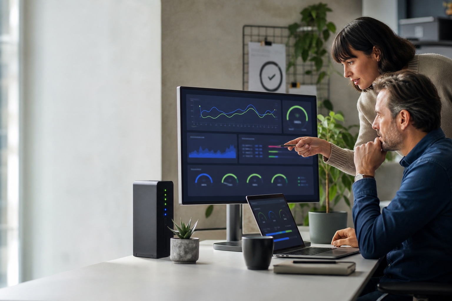
A business intelligence dashboard is a visual interface that brings important business data, metrics, and key performance indicators into one place so teams can understand performance quickly and make better decisions. Instead of reviewing multiple spreadsheets, reports, or software systems separately, users can see the most important information through charts, tables, trends, comparisons, and KPI summaries.
A good BI dashboard answers practical questions such as: Are sales increasing? Are we meeting our targets? Which products are performing best? Where are costs rising? Which locations need attention? What changed compared with last month?
The purpose of a business intelligence dashboard is not simply to display data. It is to turn data into information that helps someone decide what to do next.
How Does a Business Intelligence Dashboard Work?
A BI dashboard usually collects data from one or more business systems, transforms that data into consistent metrics, and then presents the results visually.
A typical flow looks like this:
Business systems → data collection → data preparation → KPI calculations → dashboard → business decision
Data sources may include:
- CRM systems
- Accounting or finance software
- ERP systems
- Ecommerce platforms
- Inventory systems
- Marketing platforms
- Customer-support tools
- Spreadsheets
- Databases
- Custom business applications
The dashboard can then display the information in a format appropriate for managers, executives, analysts, or operational teams.
What Does a BI Dashboard Show?
The exact information depends on the business function and the person using the dashboard.
Common dashboard elements include:
- KPI cards: headline figures such as revenue, profit, orders, leads, or stock value.
- Trend charts: show how a metric changes over time.
- Comparison charts: compare regions, products, employees, channels, or periods.
- Tables: provide detailed records when users need more information.
- Targets: compare current results with planned performance.
- Filters: allow users to view a specific location, product, date range, salesperson, or category.
- Drill-down views: allow users to move from a summary metric into more detailed information.
The best dashboard does not display every available number. It displays the information needed for a specific business decision.
Business Intelligence Dashboard Examples
Sales Dashboard
A sales BI dashboard can help managers understand pipeline and revenue performance.
Typical KPIs include:
- Total sales
- Revenue growth
- Sales target achievement
- Pipeline value
- Win rate
- Average order or deal value
- Sales by region
- Sales by employee
- Sales by product
- Conversion rate
Finance Dashboard
A finance dashboard gives management a simplified view of financial performance.
It may show:
- Revenue
- Expenses
- Gross profit
- Net profit
- Cash flow
- Receivables
- Payables
- Budget versus actual
- Profit margin
Marketing Dashboard
A marketing dashboard can combine information from multiple channels.
Common metrics include:
- Website traffic
- Leads
- Conversion rate
- Cost per lead
- Campaign spend
- Revenue by channel
- Return on advertising spend
- Email performance
Operations Dashboard
Operational dashboards focus on day-to-day activity and bottlenecks.
Examples include:
- Orders processed
- Pending orders
- Order fulfilment time
- Production output
- Delivery performance
- Process delays
- Service-level performance
Inventory Dashboard
An inventory dashboard can help businesses monitor stock and purchasing decisions.
Typical information includes:
- Current stock quantity
- Stock value
- Low-stock items
- Fast-moving products
- Slow-moving products
- Stock ageing
- Purchase trends
- Inventory turnover
Customer Service Dashboard
Support teams can use BI dashboards to track service quality and workload.
Examples include:
- Open tickets
- Average response time
- Resolution time
- Backlog
- Customer satisfaction
- Tickets by issue type
- Agent workload
Types of Business Intelligence Dashboards
1. Strategic Dashboard
Strategic dashboards give executives and business owners a high-level view of long-term performance.
They usually focus on a limited number of important KPIs such as revenue growth, profitability, customer retention, market performance, or overall business targets.
2. Operational Dashboard
Operational dashboards monitor activities that require frequent attention.
Examples include today's orders, current inventory, unresolved support tickets, active deliveries, or production output.
They may refresh more frequently because users need to react quickly.
3. Analytical Dashboard
Analytical dashboards allow deeper exploration of business data.
Users may compare periods, filter categories, examine trends, and drill into the underlying reasons behind performance changes.
These dashboards are particularly useful for analysts and managers investigating questions such as why sales declined or which customer segment is growing fastest.
4. Tactical Dashboard
Tactical dashboards sit between strategic and operational views. They often help department managers monitor progress toward medium-term goals.
For example, a sales manager might track monthly target achievement, pipeline coverage, team performance, and conversion rates.
Benefits of Business Intelligence Dashboards
Faster Decision-Making
Decision-makers do not need to wait for someone to manually compile information from several spreadsheets. Important metrics can be available in one view.
Better Visibility
A dashboard can reveal what is happening across departments, locations, products, or customer segments.
Earlier Problem Detection
Trends and exceptions become easier to notice visually. A sudden decline in sales, increase in support backlog, or unusual rise in costs can be identified earlier.
Consistent KPI Tracking
Teams can use agreed definitions for important metrics rather than calculating the same KPI differently in separate spreadsheets.
Reduced Manual Reporting
Where data integration is available, dashboards can reduce repetitive work involved in copying, combining, and formatting reports.
Better Team Alignment
When managers and employees use the same performance indicators, discussions can focus more clearly on results and action.
Improved Accountability
Targets, actual performance, trends, and ownership can be made visible to the people responsible for a process.
Better Use of Business Data
Businesses often collect large amounts of data but use only a small portion of it. BI dashboards help convert stored operational data into information that managers can actually use.
Business Intelligence Dashboard vs Report
A dashboard and a traditional business report can contain similar information, but they are designed for different uses.
| Dashboard | Traditional Report |
|---|---|
| Designed for quick monitoring | Often designed for detailed review |
| Usually visual and interactive | Often static or document-based |
| Can refresh automatically | May be produced periodically |
| Focuses on KPIs and exceptions | Can contain detailed records |
| Supports filters and drill-down | Usually follows a fixed format |
A business may need both. Dashboards are useful for monitoring, while detailed reports remain useful for analysis, documentation, and transactions.
Business Intelligence Dashboard vs Performance Scorecard
BI dashboards and performance scorecards are related but not identical.
A dashboard primarily helps users monitor and explore business information.
A performance scorecard places greater emphasis on measuring performance against defined objectives, targets, or strategic goals.
For example, a dashboard might show:
- ₹12 lakh monthly revenue
- 4.2% conversion rate
- 1,250 orders
A scorecard adds explicit performance context:
- Revenue target: ₹15 lakh — current achievement: 80%
- Conversion target: 5% — current: 4.2%
- Order target: 1,100 — current: 1,250
Many modern BI systems combine dashboard and scorecard concepts in the same interface.
What Makes a Good Business Intelligence Dashboard?
Relevant KPIs
Every metric should support a decision or business objective. If no one knows why a number is displayed, it probably does not deserve prime dashboard space.
Clear Visual Hierarchy
The most important information should be easiest to find. Headline KPIs generally belong near the top, followed by supporting trends and details.
Simple Design
A dashboard should not become a collection of every available chart type. Consistent layouts and limited visual complexity improve comprehension.
Reliable Data
A beautifully designed dashboard is useless if users do not trust the numbers.
Data definitions, sources, refresh schedules, and calculations should be consistent.
Useful Context
A number by itself may mean very little.
For example:
Sales: ₹8,00,000
becomes more useful when users can also see:
Previous month: ₹7,20,000 | Target: ₹8,50,000
Appropriate Filters
Users may need to filter by:
- Date
- Branch
- Region
- Product
- Customer type
- Salesperson
- Channel
Too many filters can make the dashboard unnecessarily complex, so include only those that support meaningful analysis.
Actionability
The most useful dashboard helps users recognize what needs attention.
Instead of showing only total receivables, for example, a finance dashboard might also show overdue receivables and the customers responsible for the highest outstanding balances.
How to Choose KPIs for a BI Dashboard
Start with the business question rather than the available data.
Suppose management wants to answer:
“Why is revenue falling?”
Useful supporting metrics might include:
- Number of orders
- Average order value
- Conversion rate
- Revenue by product
- Revenue by region
- Revenue by salesperson
- New versus repeat customers
If the objective is inventory efficiency, an entirely different group of KPIs would be required.
A useful dashboard KPI should normally be:
- Relevant to a business objective
- Clearly defined
- Reliable
- Measurable over time
- Understandable to the intended user
- Capable of influencing a decision or action
How to Build a Business Intelligence Dashboard
Step 1: Define the Business Question
Identify what the user needs to understand or decide.
Examples:
- Are we hitting our monthly sales target?
- Which products are causing excess inventory?
- Why did profit decline?
- Which marketing channel generates the best leads?
Step 2: Define the Audience
An owner, finance manager, salesperson, and warehouse manager should not necessarily see the same dashboard.
Identify who will use it and what decisions they make.
Step 3: Select the KPIs
Choose a small number of metrics that directly answer the business question.
Step 4: Identify the Data Sources
Determine where the required information currently lives.
This may include a CRM, accounting platform, ERP, spreadsheet, database, ecommerce system, or several different applications.
Step 5: Clean and Standardize the Data
If two systems use different customer names, product codes, date formats, or KPI definitions, those differences must be resolved before reliable reporting is possible.
Step 6: Design the Dashboard
Start with the most important information and organize supporting details logically.
Step 7: Validate the Numbers
Compare dashboard results against trusted source records before relying on the dashboard for decisions.
Step 8: Test With Real Users
Ask users whether they can answer their normal business questions without unnecessary clicks or explanation.
Step 9: Define Refresh Frequency
Not every metric needs real-time data.
Some operational dashboards may need frequent updates, while strategic KPIs might be refreshed daily, weekly, or monthly.
Step 10: Review and Improve
As business priorities change, KPIs and dashboard layouts may also need to change.
Do Small Businesses Need BI Dashboards?
Not every small business needs an advanced BI platform.
A BI dashboard becomes particularly useful when:
- Managers spend significant time combining spreadsheets.
- Important data exists in several systems.
- Different employees report different numbers for the same KPI.
- Management needs regular visibility across departments.
- Reporting is too slow to support decisions.
- The company has enough transactions or operational complexity that manual review is becoming difficult.
A smaller business should begin with a focused dashboard rather than creating dozens of reports.
This fits naturally into a broader digital transformation roadmap for small businesses: first identify the decision that needs better data, then build the simplest reliable reporting system capable of supporting it.
Custom BI Dashboard vs Ready-Made BI Software
Businesses can either use an existing BI platform or build a custom dashboard connected directly to their applications and databases.
Ready-made BI software may be suitable when:
- Standard connectors already support your systems.
- Your reporting requirements are relatively common.
- Internal users are comfortable with BI tools.
- You need flexible analysis and reporting quickly.
A custom dashboard may be appropriate when:
- The business has unique workflows.
- Users need a very simple role-specific interface.
- Data comes from custom applications or unusual systems.
- The dashboard must become part of an existing business application.
- Standard BI tools create unnecessary complexity.
The correct approach depends on the business requirement. Custom development should solve a genuine workflow or integration problem rather than recreate features already available in suitable existing software.
Common BI Dashboard Mistakes
Displaying Too Many KPIs
More metrics do not automatically create more insight. Too much information can hide the numbers that actually matter.
Starting With Charts Instead of Questions
The dashboard should begin with the business decision, not with choosing attractive visualizations.
Using Unreliable Data
If dashboard totals do not match trusted operational systems, users will quickly lose confidence.
No Agreed KPI Definition
Terms such as revenue, active customer, conversion, or completed order should have clear definitions.
Making Everything Real-Time
Real-time infrastructure can add cost and complexity. Use it only where the business decision actually requires it.
Ignoring the User
A dashboard created for senior management may be useless to an operational employee and vice versa.
No Ownership
Someone should be responsible for KPI definitions, data quality, access, and ongoing dashboard maintenance.
Business Intelligence Dashboard Implementation Checklist
- Define the business problem.
- Identify the dashboard audience.
- List the decisions users need to make.
- Select the essential KPIs.
- Define every KPI clearly.
- Identify the authoritative data source.
- Check data quality.
- Decide how frequently data needs to refresh.
- Choose suitable charts and tables.
- Add targets or historical context where useful.
- Keep the initial dashboard focused.
- Validate all calculations.
- Test with actual users.
- Define access permissions.
- Assign dashboard ownership.
- Review KPIs regularly.
Frequently Asked Questions
What is a business intelligence dashboard?
A business intelligence dashboard is a visual interface that combines business data and KPIs into charts, tables, summaries, and trends so users can monitor performance and make decisions more quickly.
What are the benefits of business intelligence dashboards?
Benefits can include faster reporting, improved visibility, earlier problem detection, consistent KPI tracking, reduced manual reporting work, stronger team alignment, and better use of existing business data.
What are examples of BI dashboards?
Common examples include sales dashboards, finance dashboards, marketing dashboards, inventory dashboards, operations dashboards, executive dashboards, and customer-service dashboards.
What is the difference between a BI dashboard and a report?
A dashboard is usually designed for fast monitoring and interactive exploration, while reports often contain more detailed information in a fixed format. Many businesses use both.
What is the difference between a business intelligence dashboard and a performance scorecard?
A BI dashboard primarily presents and explores business information, while a performance scorecard focuses more explicitly on measuring results against targets and strategic objectives. The two approaches can also be combined.
Does a BI dashboard need real-time data?
No. The correct refresh frequency depends on the business decision. Some operational information may need frequent updates, while strategic metrics may only need daily, weekly, or monthly refreshes.
Which KPIs should a business intelligence dashboard include?
The correct KPIs depend on the dashboard's purpose. A sales dashboard may include revenue, target achievement, pipeline value, conversion rate, and average deal size, while an inventory dashboard may focus on stock levels, turnover, ageing, and low-stock items.
Can a small business use business intelligence dashboards?
Yes. A small business can start with a focused dashboard covering a few important KPIs. Advanced BI infrastructure is unnecessary if a simpler reporting solution can answer the required business questions.
Final Thoughts
A business intelligence dashboard is valuable when it turns scattered business data into information people can understand and act on quickly.
The strongest dashboards are not necessarily the most complex. They have a clearly defined audience, reliable data, a focused group of KPIs, appropriate context, and a clear connection to business decisions.
Start with one question, identify the data required to answer it, create the simplest useful dashboard, verify the numbers, and improve it based on how real users work.
If your business has data spread across spreadsheets, databases, or disconnected applications and standard reporting tools cannot fit the workflow, explore Aslisite's custom software development services for tailored dashboards, integrations, and business systems.
Ready to scale your digital presence?
Join businesses growing with Aslisite. Let's discuss your project today.